The Sandstone Point Hotel

Back in April, Sauce was contacted by the Comiskey group, as the owner had a new project he was working on. Sauce had previously worked for David at one of his childcare centres on the Sunshine Coast, so it was great to continue this partnership. 

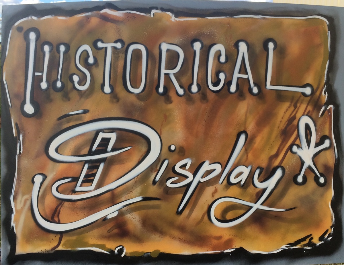
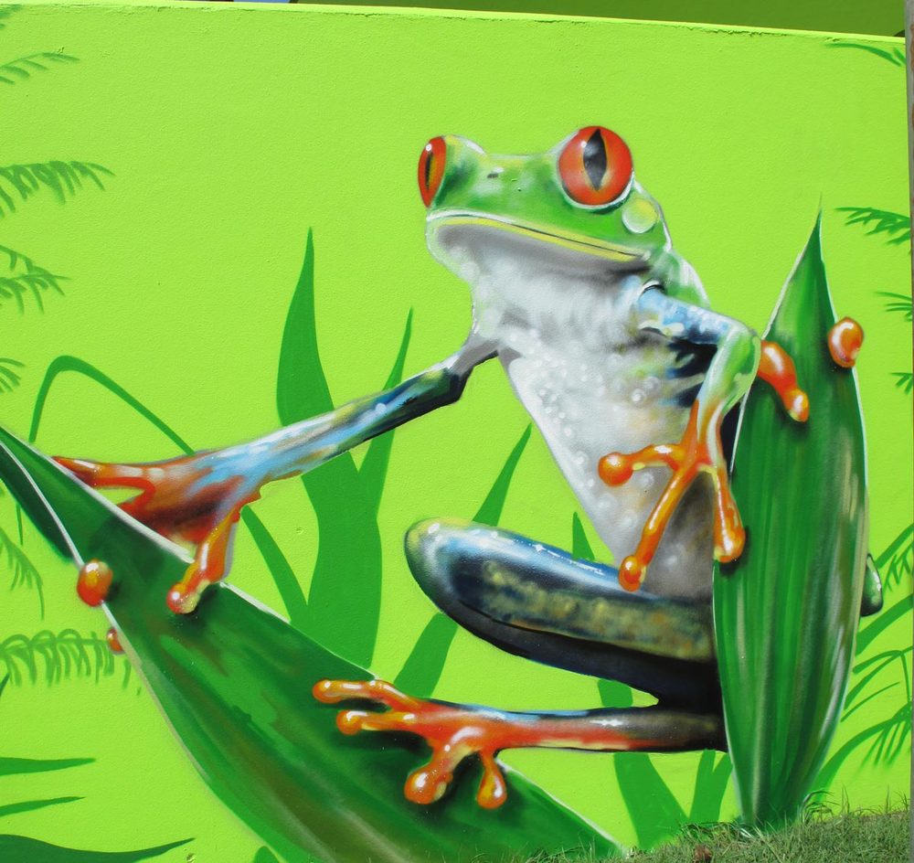
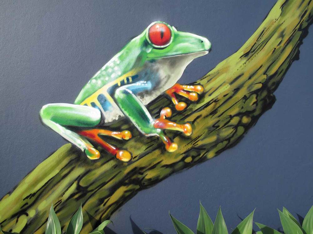
David had numerous ideas about the designs and imagery for his latest development, the Sandstone Point Hotel. Since the hotel has numerous different bars, eating areas and meeting points, cleverly, David wanted a different focus in each area or zone. David also chose to begin the mural and artwork phase prior to opening, so Sauce was in there, painting amount the construction site. By focusing on each different zone, Sauce was able to design and tailor artwork to suit the usage and the layout of the area. The different zones, also provided Sauce with different artistic opportunities. The images below show the signage, portrait, and ghost-signs. All of which were a welcome challenge. 

From the design phase, where the client used Pinterest to indicate the themes and perspective, to the application of the artwork, this is by far, was one of the more intricate, varied and professional artworks Sauce has created. It's not only a portfolio piece, but it also an example of how businesses can use artwork to suit their needs and transform an area, by standing out from all of their competitors. This project was the perfect balance of artwork, patronage and commercial value. Sauce hopes to both work with the Comiskey Group again, and other likeminded clients who want to stand out from the crowd. 


As as the weather warms up and the days grow longer, I strongly recommend a trip north of Brisbane to the Sandstone Point Hotel. Baby Boomers will be pleased to know the Beach Boys will be performing there in the near future, and there's even a petting zoo for the little ones. So grab your family, get in the car, and get ready to enjoy a cool drink, tasty food, great artwork and seaside views. 

Peace,

 Ainslie Rose. 

sphcomiskeywhiskey_web.jpg
sphmatthewflinders_web.jpg
sphcellar_web.jpg
sphoysters_web.jpg
SPHoystersdetail_web.jpg
sphflowerstall_web.jpg
SPHdetail_web.jpg
Video Block
Double-click here to add a video by URL or embed code. Learn more

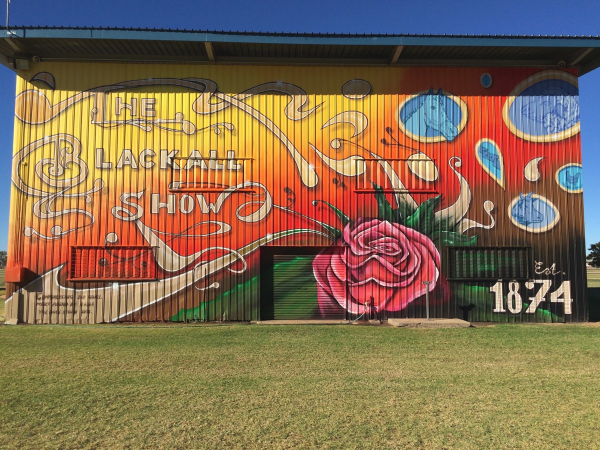
The Blackall Show

In September of last year, the Blackall Show Committee decided they needed to create a colourful backdrop for their annual show. Sauce has created many different murals in both Blackall and Central Queensland, so it was easy to organise another trip out to Central Queensland. 

Over a series of emails, Sauce, myself and the Blackall Show Committee organised the design, for one of the tallest murals Sauce has created to date. The mural needed to both add colour and be a backdrop for all of the cultural activities and festivities associated with the show. It also needed to create an atmosphere which recognised over a century of history and commitment to community. All while creating a new layer of history for many years to come. Sauce also facilitated workshops and demonstrations at the show. It was non-stop painting! 

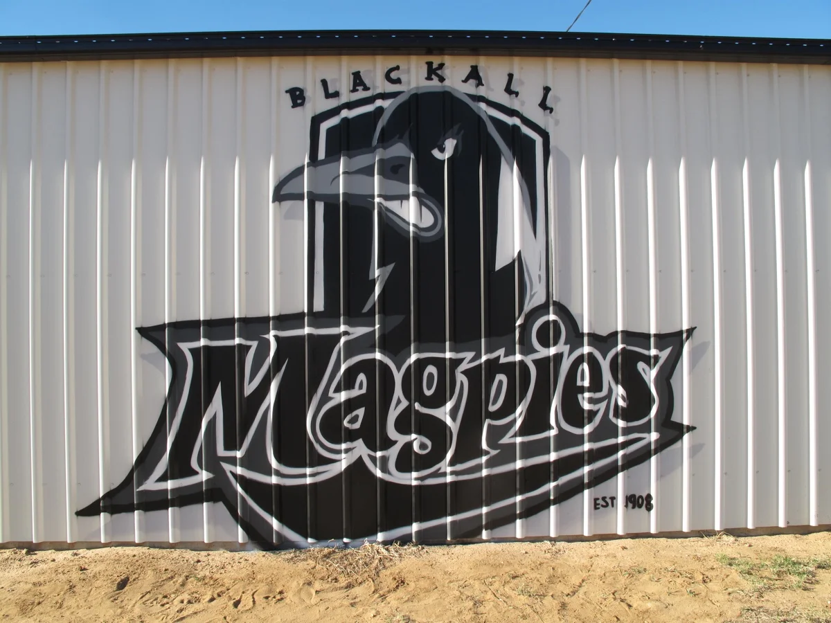
Once Sauce was in Blackall, it didn’t take long for the locals to say hello and ask about other projects and walls that Sauce could fit in while still in the area. He managed to paint some extra signage, and create a welcoming environment for the local Men’s Shed. The local Magpies also requested a mural, and Sauce was happy to oblige. 

As always, Sauce enjoyed the good old-fashioned county hospitality and hung out at the best hotel in the West.


Peace,

Ainslie Rose. 

The Modern Grocer

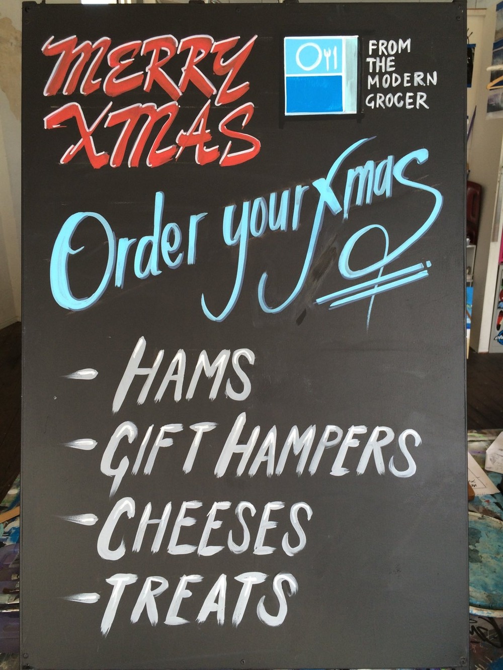
When a local Murwillumbah delicatessen, The Modern Grocer asked Sauce to whip up a quick sign to advertise their latest specials, he was happy to oblige. Sauce has begun to expand his lettering, sign-writing and typography skill lately and this chalk board was a simple example of his letting abilities. If you’re a local business in Murwillumbah and looking to update your signage, feel free to drop by the studio on Proudfoots Lane. We’d love to help you out. 


Uki Supermarket

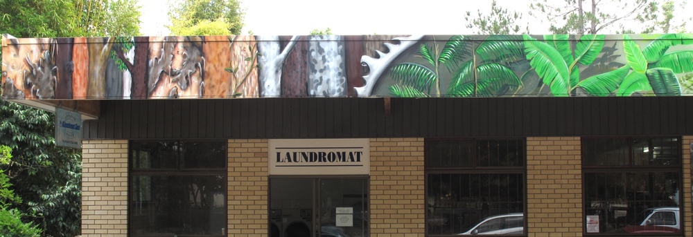
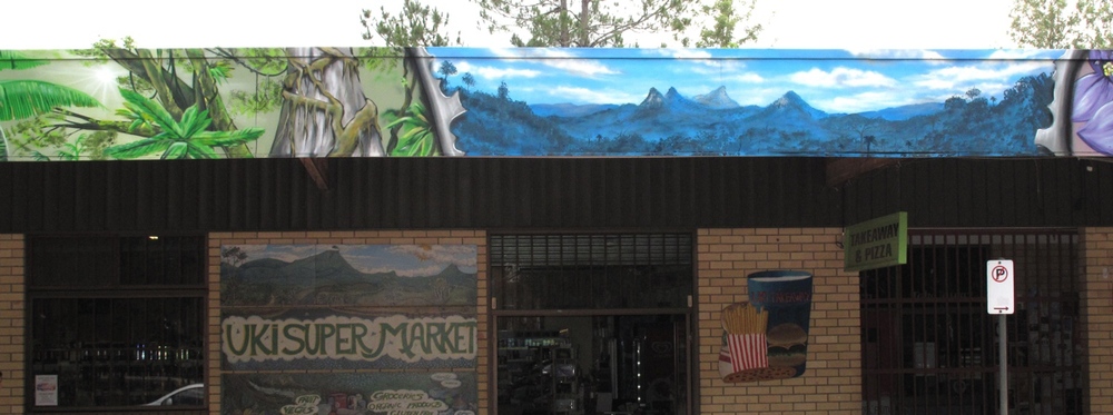
In between fighting bureaucracy and nailing some designs in the studio, I packed up my trestles and ladders and headed to Uki Supermarket, a local village fifteen minutes out of town. Dave and Bec, the Supermarket owners, required something which incorporated their branding, suited the locality and combined their own theme and design. I was pleased with the end result as I think it makes an excellent showcase of combining hand-crafted artwork with a unique branding perspective.